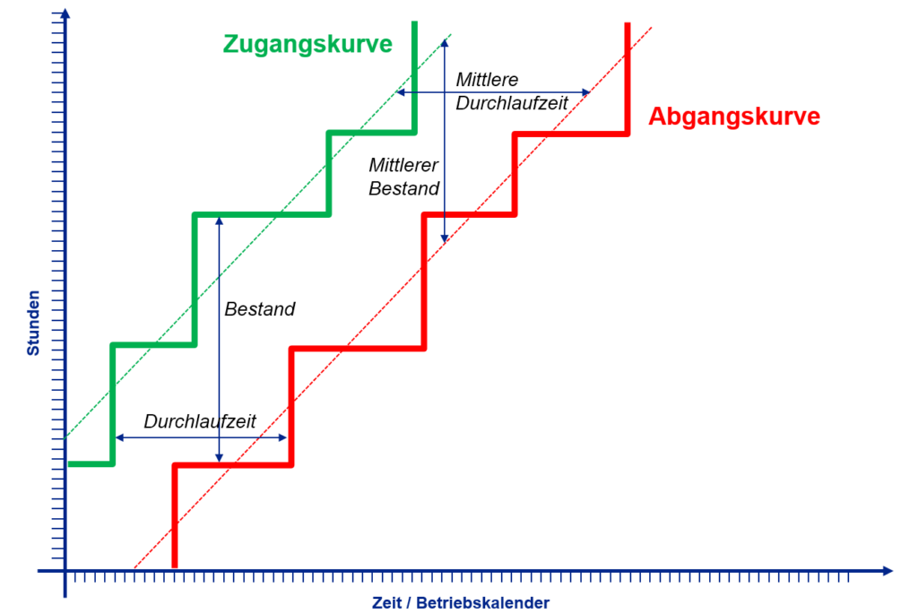
A throughput diagram can be used to monitor the load situation of a production system, a production area or the entire production process. A flow chart always consists of an entry curve and an exit curve. The receipt curve shows the cumulative order volume, measured in hours for setup and production, at which point in time it was received by the work system under consideration. Accordingly, the outflow curve shows at which point in time which hourly volume has flowed out with the completion of a production order.
If trend lines are drawn through the resulting staircase diagrams, the vertical distance between the two trend lines shows the average number of hours in the work system. The horizontal distance shows the average throughput time.
Our tip:
In practice, there is often a load constellation at different work systems or production areas where the entry and exit end lines run parallel but are a long way apart. On the one hand, such a constellation shows that the work system is not overloaded, as on average as much workload flows out as flows in. On the other hand, the large distance between the lines indicates a long queue at the system. In such cases, throughput time and work in progress can be reduced simply by temporarily increasing the performance of the work system. This can take the form of extra shifts, weekend work or outsourcing production orders.

Further information on this topic can be found here:

